Summary
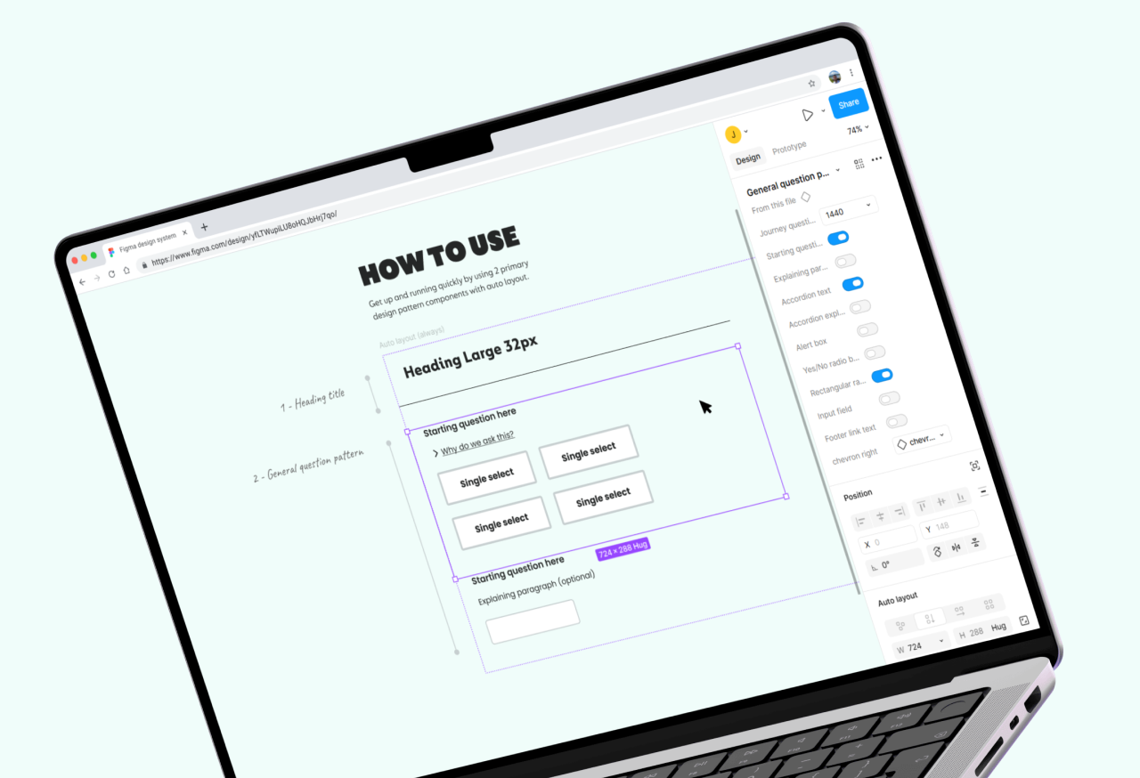
Go.Compare insurance journeys (question sets) generally follow a pattern of: 1. Question 2. Help text 3. Answer choice. By utilising this framework, a design system was created in Figma to enhance the efficiency of crafting precise insurance journeys, ensure a uniform methodology, and serve as the definitive reference point for designers, product owners, and developers.
Background
The old Go.Compare design system is extensive, but not practical as it hadn't been kept up to date, so its accuracy had lapsed over time. Also it was clunky.
My role
Build all UI elements from scratch • Extend Figma's styles to component patterns with on & off switches • Build interchangeable assets between desktop & mobile views • Present to key stakeholders and get business buy-in
Design & documentation
Presentation


